Seamless In-App Payment Experience
Led the redesign of BCBS Illinois mobile payments system, transforming a fragmented external web flow into a seamless in-app experience focused on reducing friction while maintaining enterprise-level security standards.
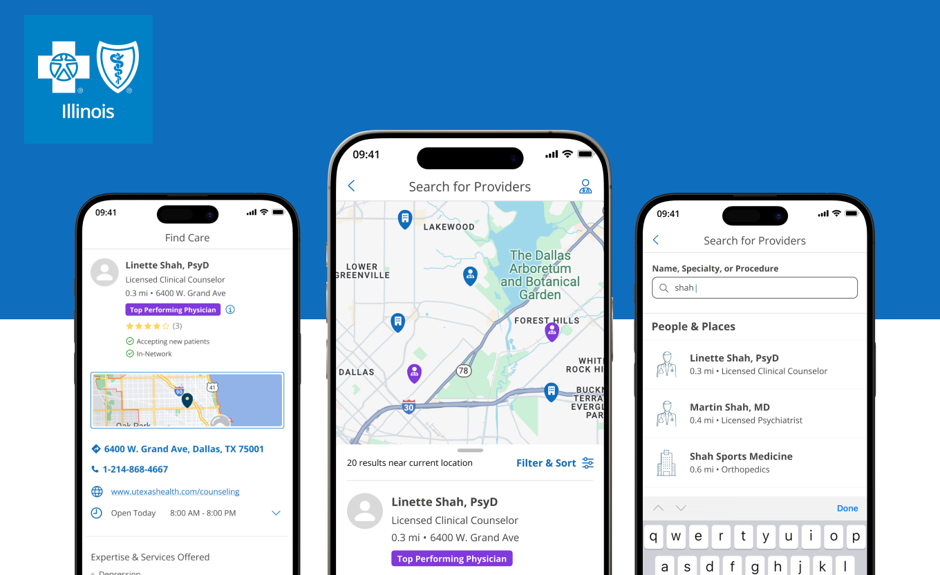
Seamless In-App Payment Experience
Blue Cross Blue Shield Illinois needed to bring their bill payment experience into the native mobile app. Members were being redirected to an external browser to complete payments — a fragmented experience that caused high abandonment and eroded trust at the most critical moment in the member journey.
Our goal was clear: design a fully native in-app payment flow that kept members in a single trusted environment — from selecting a plan to confirming payment in three focused steps.
The result was a compliant, seamless experience that dramatically improved completion rates and became one of the highest-rated features in the app.
The system lacked a native payment solution within the app experience
Surveys of 500 members revealed 63% were dissatisfied with leaving the app to make payments, and 48% had missed payments because of the cumbersome browser login process.
- Usability testing uncovered high drop-off at the redirect point, frustration with redundant authentication steps, and a critical break in the end-to-end experience at the moment of payment intent. Payment-related tasks scored lowest in CSAT and were directly increasing support costs.
What We Built
- Fully native payment flow eliminating all external redirects and re-authentication
- Saved payment methods for faster one-click repeat transactions
- Auto-pay setup with clear confirmation and visual trust cues
- Progressive 3-step structure: Select → Confirm → Done, reducing cognitive load
- Enterprise security requirements embedded without breaking the user flow
The Success
We saw a drastic increase in payment completion through User Testing campaigns and initial rollout.
Payment Completion Rate
+37%
Increase compared to legacy browser-based flow. Keeping members 'in one lane' dramatically reduced drop-offs at the point of payment intent.
Task Success Rate
91%
Of usability participants completed the in-app payment without assistance. Simplified authentication and clear steps drove success.
Call Center Volume
−36%
Decreased call center volume for billing inquiries and reduced missed payments, directly impacting business operations and member retention.
Built with the right stack


What our client said
Blue Cross Blue Shield of Illinois
Senior Product Designer, BCBS Illinois
“This project taught me that even within highly regulated industries, there's space for simplicity. By mapping the system holistically, we uncovered friction points invisible to siloed teams. The lesson: always align design solutions with both enterprise constraints and user emotional states.”
Christos Trutanich
Senior Product Designer, BCBS Illinois
Explore other projects
From startups to Fortune 500 — see more of what we've built.
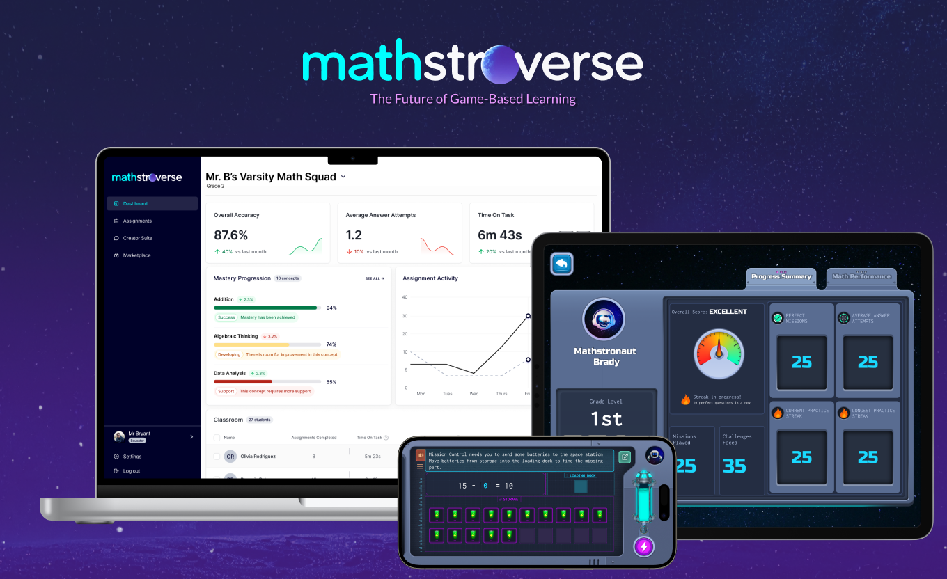
Mathstroverse
Designed the Mathstroverse Educator Portal Assignment Creator — an intuitive interface enabling teac…
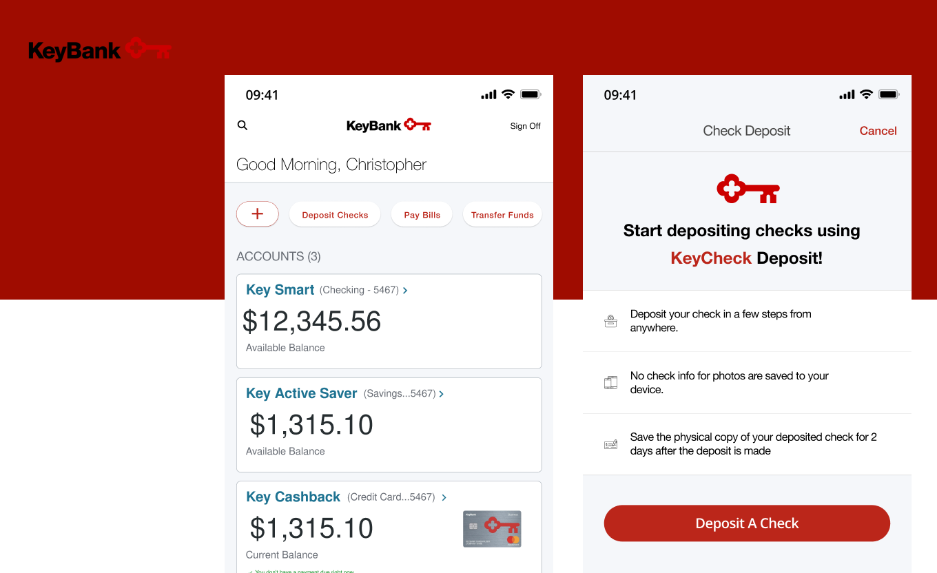
KeyBank
Designed and developed a streamlined mobile check deposit experience for KeyBank, making one of the …
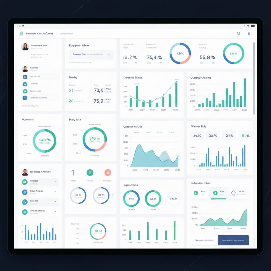
Vanguard
Designed and developed Vanguard's Automatic Investment Plan feature, enabling customers to automate …